Learn the story behind a major rebranding Tabernacle Baptist Church has recently undergone.
About Tabernacle Baptist Church
The church has been around a long time in the community. It was founded in 1899, so there is a lot of history. The church saw its fair share of ups and downs over the years. About 10 years ago, the church was struggling with leadership changes and an exodus of younger families. In 2012, this began to change under a new pastor with a strong vision and a willingness to take risks and push for progress.
The church has made great strides in the community by being active in many of our big community-wide events and festivals, they host many different organizations and sports leagues at our campus, and they are active in our schools.
Over the past few years, they began to put an emphasis on family discipleship and saw a steady influx of younger families who are looking to take a deeper step in their faith. They are currently seeing another influx of younger families with the opening of a new preschool and children’s ministry building.
One of the main goals behind the rebranding was for the church
to simply be recognized in the community.

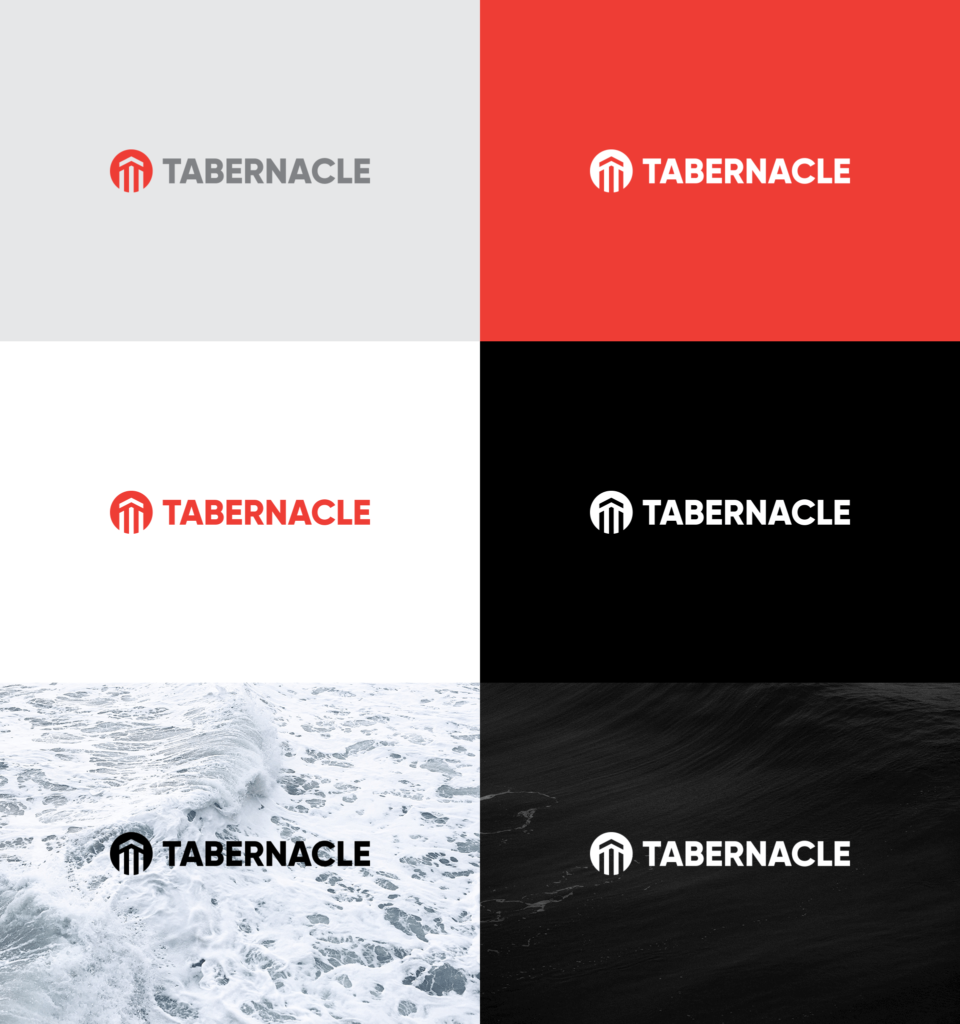
What the church logo design represents
When the current pastor came in 2012, he had a strong desire to establish a strong brand and name in the community. The worship center, where it faces the road, has a unique, triangular architecture featuring three posts. Being at the end of the grunge trend, the church adopted a logo that resembled the front of their building while also looking like the front of a tent (or Tabernacle).
Although it was unique and very well known in our community, it was not a very versatile design. With their new children’s building project, they also decided to get new signage for the building. This provided a good opportunity to revisit the logo. Their older campus and their newer additions both feature a midcentury modern architecture. The logo they ended up with shared some features with their previous logo (they called it “the housetop”)… a triangle on top and three vertical lines but also leaned towards a mid-century modern feel.

Meaning of colors
Our previous logo started off as a salmon type color. When Jeff Stapleton took over as the Pastor of Media and Communications, he slowly shifted the color to reddish orange. The color itself doesn’t have a particular meaning, but they wanted to keep that reddish orange as the base. They wanted a mid-century modern feel and did quite a bit of digging through old samples as well as newer renditions of mid-century modern marketing material and came up with a set of colors that looks great together.

Find out more
We would like to thank Jeff Stapleton from Tabernacle Baptist Church for sharing the story behind the design.
Download Tabernacle Baptist Church Style Guide
To find out more about the church visit their website and follow them on social media:
