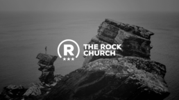
A church logo doesn’t have to be complex. The Rock Church has a simple, and easy to read logo that is also very memorable.
We really like how the three starts are fit into the circle. The typography is really strong with the sans-serif font that is used.
Find out more about the church at their website: The Rock Church
